
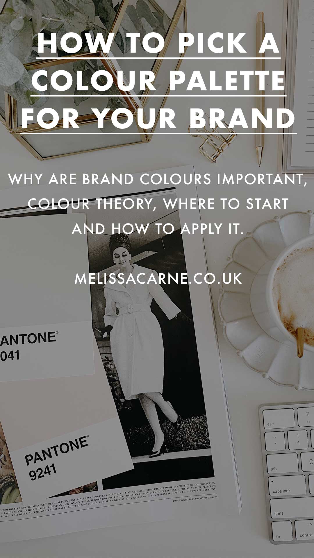
How to pick a colour palette for your brand, small business or start-up
Picking a colour palette can feel like a daunting job, if you love colour it can feel like there are just too many to choose from. Whereas on the other hand if you feel like creativity isn’t your strongest suit it can feel like you don’t even no where to start!
In this blog post I will talk you through why brand colours are important, colour theory, where to start and how to apply it. So hopefully it will help you on your way to creating a visually beautiful brand colour palette.
Why are brand colours important?
Colours elicit emotions, emotions drive our decision making and therefore buying habits.
As a brand you want to create a strong emotional connection with your customers. You want them to immediately recognise you and your brand values however, that can be really difficult to tell just from your logo alone. This is where colour palettes can come in and help support your brand identity, they can provide a visual cue shortcut straight to your clients hearts.
Colour theory
Colour theory is all about what colours make you feel what emotion.
In today’s society we associate the colour pink with the female gender, which elicits the emotions of love, care and femininity. On the other hand the colour blue is associated with the male gender, which evokes the emotions of trust, loyalty and masculinity. These uses of colour are a
construct made up by our society, pink has not always been for girls and blue has not always for boys.
However, colour theory can go a lot deeper than “pink is a pretty colour for girls.” Colour theory can be linked to the very evolution of humans. This happens through the connection of certain colours associated to particular objects. Red for example, makes people feel the emotions of fear and therefore on the look out for danger. This is because blood is the colour red and blood can often be caused by a fight, injury or predatory attack.
So where do you start?
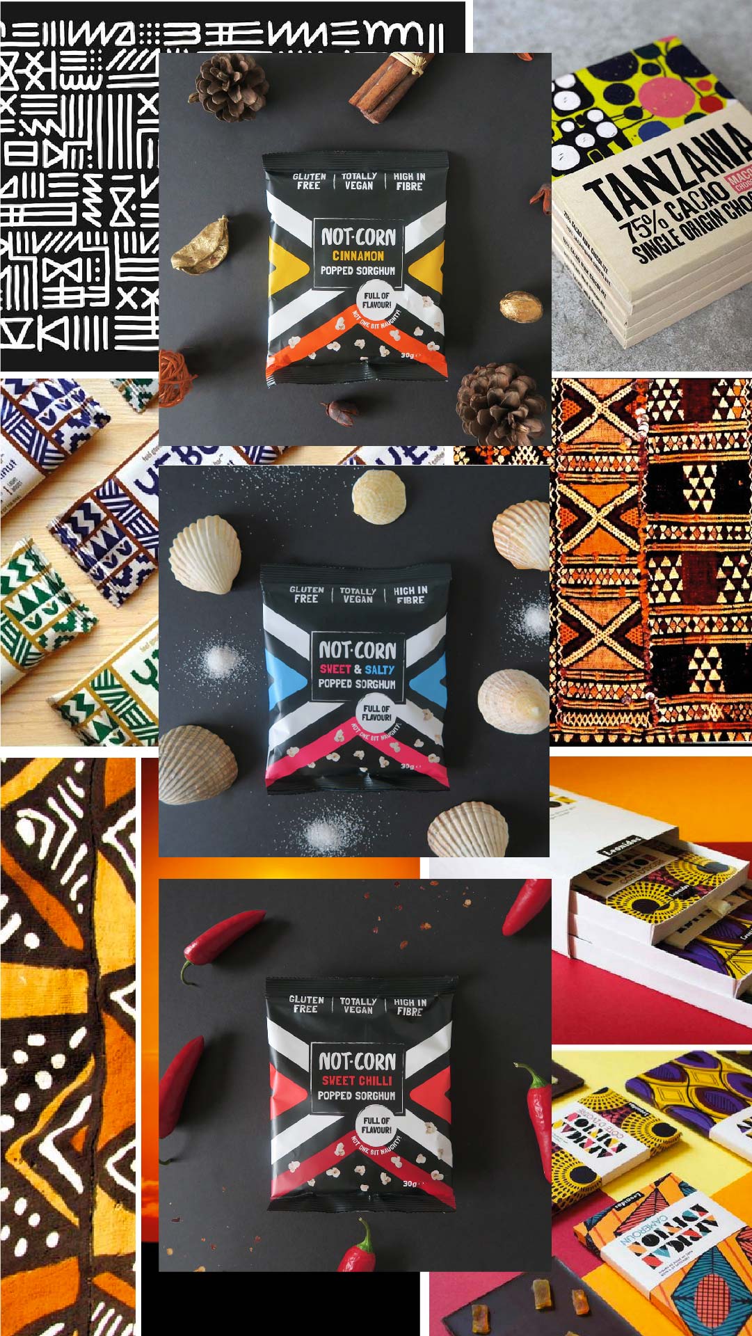
However, if your brand is bold and daring you might want to flip this approach on its head. The best way to stand out on a supermarket shelf is to do the opposite of what everyone else is doing. As you can see I have done that with a client of mine who created the superfood snack, Not.Corn. Because it’s a healthy snack you would expect to see neutral colours however, we went for a striking black with a bold pattern which nobody else in the same category was doing. This design
choice related back to initial concept of it being an African grain. As well as the brand colours and design conveying its African heritage messaging to its potential consumers it also had great impact on the supermarket shelf.
How do you apply your colour palette to your branding?
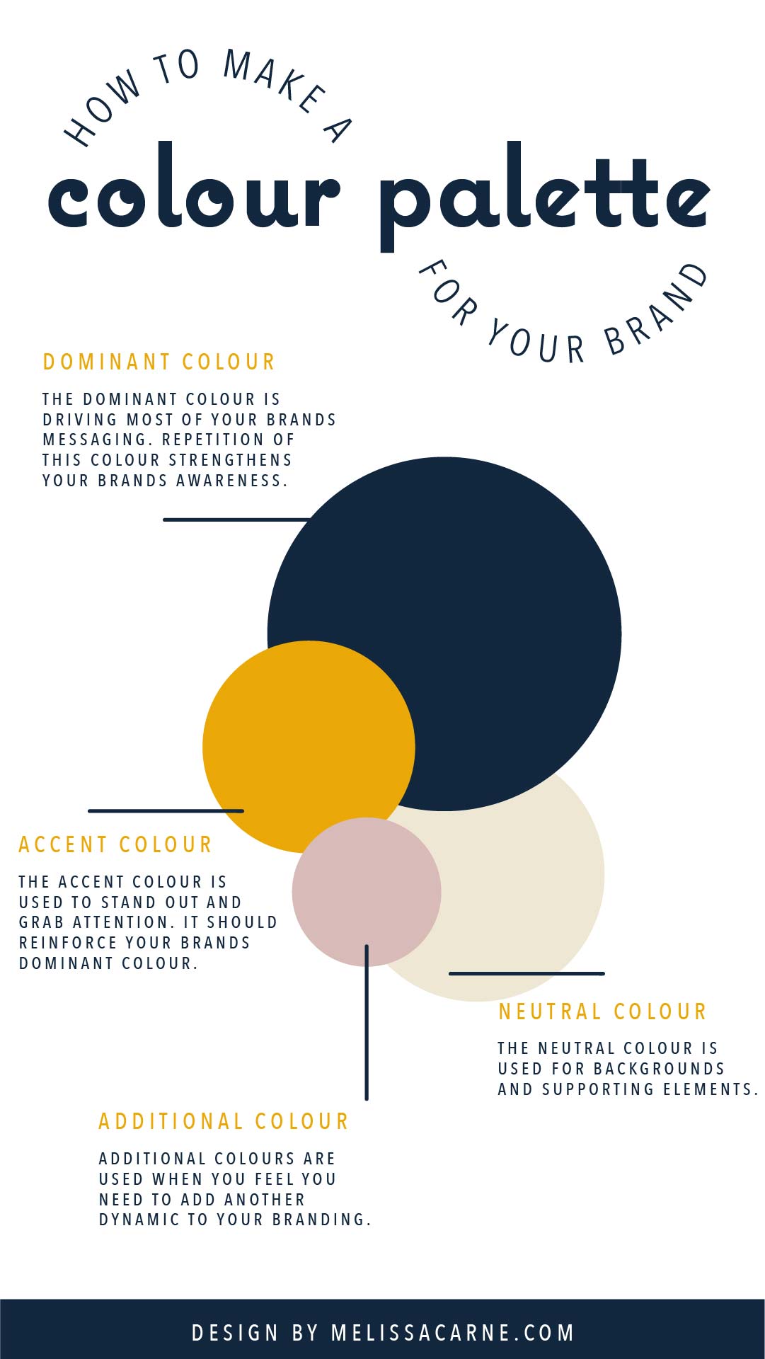
- A neutral colour: used for backgrounds and supporting elements.
- An accent colour: used to stand out and grab attention however, it should reinforce your brands dominant colour.
These 3 colours can then be used as the building blocks for your visual identity (you can of course pick additional if you feel that it is needed.) These colours will help form the base of your collateral items such as: logo design, website design, storefronts, in-store design, staff uniforms, advertisements and many more.
If you are still a bit confused and unsure places like Pinterest are a great resource for recommending and finding complimentary colour palettes.
Summary
I hope you enjoyed this blog post about colour palettes and theory to help you with your branding. Other blog posts I think you might also enjoy are: How to make a mood board for your brand, why a brand isn’t just a logo and why is branding so important for startups?
If you’re still looking for more help and you want to hand over your branding to a professional I would love to hear from you, please send me a message to contact@melissacarne.co.uk and I will be sure to get back you.
Lots of love, Melissa x